Summary

This page is designed to explore comprehensive race data and provide insights into performance metrics.

Use the dashboard selectors and visualizations to navigate through the data and gain valuable performance insights. The year of the events, gender and distance can be selected to filter the data and focus on specific competitions.

World map

The geographical visualization of the locations where events analyzed by the PACE system have taken place allows users to quickly identify the locations of competitions and sports events.

Highlighted performances

This list displays highlighted performances based on several criteria:

  • World records
  • National records
  • Olympic races
  • Seasonal Bests, Personal Bests

This performances are ranked by the highest result score assigned by the World Athletics. See the World Athletics World Rankings documentation for more information.

Download options
  • Data in XLSX format: Allows users to download the data displayed in the tab in Excel format for alternative analysis.
  • Report in PDF format: Option to download a detailed report that includes all the data and analyses presented in the tab.
AI button

A concise and detailed summary of the data and analyses is provided, facilitating a quick understanding of the key information.


Competitions

Use the selectors to select the sporting event you wish to analyse. Once a competition is chosen, the athletes that achieve their personal best, seasonal best or (national, continental or world) records are shown on the right sidebar.

Race visualization

This card offers an immersive visualization of the race dynamics, allowing users to explore the event in detail. Key features include:

  • Summary: Explore the average speed of the race divided into splits, offering insights into pacing strategies.
  • Position Changes: Track how athletes changed positions throughout the race, highlighting strategic moves and fluctuations.
  • PACE: Analysis of the pace of the race and the different groups formed.
  • Highlights: Identify the most decisive splits in the race where performance differences significantly impacted outcomes.
  • Photo Finish: Last split analysis.
  • Replay: Relive the entire race through a dynamic visualization, enabling a detailed review of strategies and performances.

    This isn't currently available, but it's a feature we're working on.

Technical features

This card delves into the technical performance of the runners during the race, providing advanced metrics and insights. Key visualizations include:

  • Position Changes: Analyze how athletes moved through the race. They're sorted left to right by their final position.
  • Remaining Work Capacity: Monitor how each athlete managed their endurance across the splits.
  • Speed by Split: Analyze each runner's pace throughout the race, highlighting variations and strategies.
  • Critical Speed Percentage: Examine how close runners were to their maximum sustainable speed at different points in the race.
Download options
  • Data in XLSX format: Allows users to download the data displayed in the tab in Excel format for alternative analysis.
  • Report in PDF format: Option to download a detailed report that includes all the data and analyses presented in the tab tab.
  • Download charts: Users can download the visualized charts for use in presentations or reports.
AI button

A concise and detailed summary of the data and analyses is provided, facilitating a quick understanding of the key information.


Athlete overview

This screen displays the historical performance of the selected athlete.

On the right side, key performance metrics are highlighted, including personal bests across various distances, the total number of podium finishes, and the athlete's first year of competition.

Athlete historical performance

This scatter plot visualizes, for a single distance, the athlete's race times over time, showing how their performance has evolved throughout the years. Choosing another athlete allows for a clear comparison of performance trends over time, helping to analyze improvements, consistency, and milestones achieved by each athlete.

The distance and round can be changed using the upper right corner button.

Power Law analysis

This plot shows the Power Law of the athlete. The scale can be changed to logarithmic using the upper right corner button.

Download options
  • Data in XLSX format: Allows users to download the data displayed in the tab in Excel format for alternative analysis.
  • Report in PDF format: Option to download a detailed report that includes all the data and analyses presented in the tab.
  • Download charts: Users can download the visualized charts for use in presentations or reports.
AI button

A concise and detailed summary of the data and analyses is provided, facilitating a quick understanding of the key information.


Athlete performances

Use the selectors to analyze and compare the performance of athletes in detail. Using interactive selectors, users can filter by a specific athlete, race distance, time period, and competition category. Once the filters are applied, two key metrics are displayed. Comparison between athletes is possible.

Average performance

A graphical representation of the athlete's average passing times across race splits, showcasing their consistency and variations throughout the competitions.

Average Work Capacity

An analysis of the athlete's energy expenditure and physical effort during the race, providing insights into endurance and pacing strategies.

Download options
  • Data in XLSX format: Allows users to download the data displayed in the tab in Excel format for alternative analysis.
  • Report in PDF format: Option to download a detailed report that includes all the data and analyses presented in the tab.
  • Download charts: Users can download the visualized charts for use in presentations or reports.
AI button

A concise and detailed summary of the data and analyses is provided, facilitating a quick understanding of the key information.


Athlete profiling

In this page, cluster identification of all the runners for the available distance in our database is performed. A network linking athletes that run more similar is displayed, as well as their average performance in each split, divided by clusters.

The user can modify the selector inside the network to study an athlete individually, and see how each of them is situated in each cluster, and which is the most similar athlete to them.

Athlete neighbors

Communities found in the athlete network. The user can click on a node to see the athlete's profile.

Athlete clusters

Different time series enclosed in each cluster. The user can click on a cluster to see the athletes' profiles.

Download options
  • Data in XLSX format: Allows users to download the data displayed in the tab in Excel format for alternative analysis.
  • Report in PDF format: Option to download a detailed report that includes all the data and analyses presented in the tab tab.
  • Download charts: Users can download the visualized charts for use in presentations or reports.
AI button

A concise and detailed summary of the data and analyses is provided, facilitating a quick understanding of the key information.


Simulation conditions
Entry list
Simulation parameters
Victory probability
Mean victory time
Mean time differences

CORS simulation

This screen provides a comprehensive overview of simulated race results, offering detailed insights into athlete performance and probabilities. Users can select parameters such as gender, distance, competition category, and pace to customize the simulation. Use this dashboard to explore race predictions, identify strong contenders, and analyze competitive dynamics among athletes.

The simulation page includes three different tabs: Stats, "Simulation tuning" and Head to head.

The right sidebar, common for all tabs, identifies the athlete with the highest victory probability, along with their winning time interval.

Stats

This tab shows the results of the simulation for the selected athletes and conditions. It contains the following plots:

  • Simulation times: A density plot shows the distribution of simulated times for all selected athletes, providing an overview of their performance variability.
  • Victory probabilities: A bar chart displays each athlete's likelihood of winning, expressed as a percentage, highlighting the most probable race victors.
  • Podium probabilities: A bar chart that outlines the chances of athletes securing a top-three finish, offering further context on race competitiveness.
Simulation tuning

This tab allows users to fine-tune the simulated performance of each athlete using two parameters:

  • Opinion: A value from -3 to 3 that reflects what you think will happen with the athlete in this race.

    • 0 means neutral: you expect them to perform normally based on past results.
    • A negative value means you think they will run faster than usual — their time will be lower, maybe because they’re in great shape or have improved recently.
    • A positive value means you think they might run slower than usual — their time will be higher, for example due to fatigue or injury.
    • The further from 0, the stronger the adjustment in performance.
  • Confidence: How sure are you about your opinion?

    • 100% means you’re completely sure: the simulation will follow your opinion closely.
    • 0% means you're not sure: the simulation will still consider your opinion, but allow more randomness.
    • In between (e.g. 50%), your opinion will matter, but the athlete’s performance can still vary.
  • Opinion: A value between -1 and 1 that reflects the user’s personal assessment of the athlete’s expected performance in the simulated race. The default is 0, meaning no adjustment. Positive values (up to 1) suggest the athlete is likely to outperform historical data—perhaps due to being in peak form. Negative values indicate expected underperformance, such as returning from injury or poor recent results.

  • Confidence: A percentage (0–100%) representing how strongly the user believes in their opinion adjustment. Higher confidence gives more weight to the opinion when modifying the simulation output.

Head to head

Users can compare two specific athletes, analyzing their probabilities of outperforming each other in the simulated scenario. Specifically, this tab includes:

  • Victory probability: Comparison of the probability that one athlete finishes earlier than the other.
  • Mean victory time: Mean time for each athlete in those races when it beats the other athlete.
  • Mean time differences: Mean difference time between both athletes in those races when it beats the other athlete.
Download options
  • Data in XLSX format: Allows users to download the data displayed in the tab in Excel format for alternative analysis.
  • Report in PDF format: Option to download a detailed report that includes all the data and analyses presented in the tab tab.
  • Download charts: Users can download the visualized charts for use in presentations or reports.
AI button

A concise and detailed summary of the data and analyses is provided, facilitating a quick understanding of the key information.


CORS recommendation system

This screen provides a recommended running strategy for the selected runner.

The user selects the position limit. Thus, if the user wants a winning running strategy for the selected athlete, he must choose a limit equal to 1. Similarly, if the user wants a suitable running strategy for a podium finish, a threshold equal to 3 must be chosen.

On the right sidebar, a summary of the best-case scenario is shown, with the estimated probability and mark interval in that running scenario.

Probabilities

An estimate of the probabilities (and corresponding 95% confidence interval) of reaching the chosen threshold position is presented for each scenario.

Simulated times

A density plot shows the distribution of simulated times for the selected athlete in all selected scenarios, providing an overview of the performance variability.

Download options
  • Data in XLSX format: Allows users to download the data displayed in the tab in Excel format for alternative analysis.
  • Report in PDF format: Option to download a detailed report that includes all the data and analyses presented in the tab tab.
  • Download charts: Users can download the visualized charts for use in presentations or reports.
AI button

A concise and detailed summary of the data and analyses is provided, facilitating a quick understanding of the key information.


About PACE

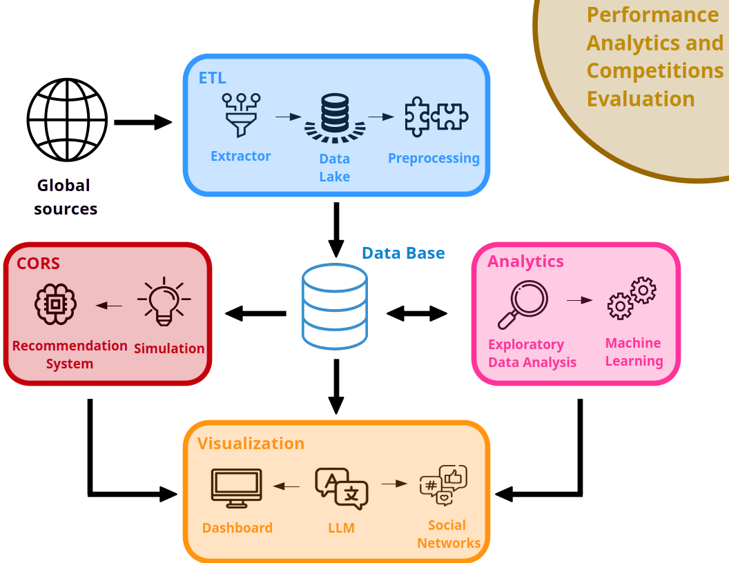
PACE (Performance Analytics and Competitions Evaluation) is a comprehensive sports data analysis solution, combining cutting-edge technology with machine learning algorithms and advanced simulation techniques.

It aims to provide comprehensive tools to optimize athletic performance, from daily training to the most demanding competitions. From data mining to visualization and strategy generation, PACE facilitates informed decision making and the development of high-level competitive strategies. PACE is a powerful and versatile tool, capable of transforming large volumes of data into actionable information that drives performance and supports athletes on their path to competitive success.


Key benefits of PACE
  • Performance optimisation: Thanks to predictive analytics and simulations, athletes and coaches can adjust their preparation and strategies to maximise performance in each event.
  • Improved decision making: The system provides real-time information and data-driven recommendations, facilitating agile and accurate decision-making during competitions.
  • Efficient monitoring: Customisable dashboards and interactive visualisations allow users to track progress and adapt their tactics accordingly.
  • Personalised strategies: Simulation models allow users to anticipate challenges and adapt race strategies to specific conditions, giving athletes a competitive edge.
PACE diagram
Development team
  • High Performance Research Group in Foundations and Applications of Data Science, Data Science Laboratory, Research Centre for Intelligent Information Technologies at the Rey Juan Carlos University, Spain.
  • High Performance Research Group in Sports Science, Research Center for Sports Science at the Rey Juan Carlos University, Spain.
Funded by the European Union, NextGenerationEU light logo Funded by the European Union, NextGenerationEU dark logo